
Cracker Barrel’s New Logo Sparks Outrage — But Is It Really About ‘Woke’ Politics? by Julianna Frieman

Wisdom About Human Flourishing, by M.D. Aeschliman
August 23, 2025
Disney Wants Ideas For Movies That Will Appeal To Young Men. I Have A Few, by John Daniel Davidson
August 23, 2025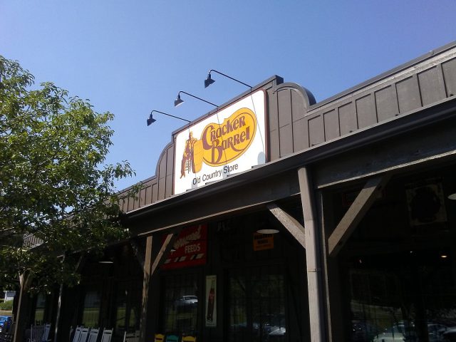
Cracker Barrel restaurant in Cleveland, Tennessee in 2017 (JJBers of Willimantic, Connecticut/cc-by-2.0/Wikimedia Commons)
By Julianna Frieman, The American Spectator, August 22, 2025
Julianna Frieman is a writer based in North Carolina. She received her bachelor’s degree in political science from the University of North Carolina at Charlotte. She is pursuing her master’s degree in Communications (Digital Strategy) at the University of Florida. Her work has been published by the Daily Caller, The American Spectator, and The Federalist. Follow her on X at @juliannafrieman.
Corporate brands are simplifying, while personal brands grow more complex.
Related posts

August 23, 2025

August 23, 2025

August 23, 2025